What are the latest colours for interior design in 2024? At the start of every year, I know you can’t help but get excited about what colour will dominate the interior design scene.
It’s almost as thrilling as seeing the new fashion trends on the catwalk.
But unlike fashion, which constantly changes with the seasons, interior design trends tend to stick around for longer.
Why? Let’s be honest: you don’t change your home decor as often as you change your clothes, right?
That’s why it’s so important to get it right. Luckily, we’ve got your back.
The prominent players in the paint and interior design industries have just released their colours of the year for 2024, and let me tell you, it’s going to be a treat.
So, what are the latest colours for interior design in 2024?
Let’s take a look.
What Are The Latest Colours For Interior Design In 2024?
Blue Nova
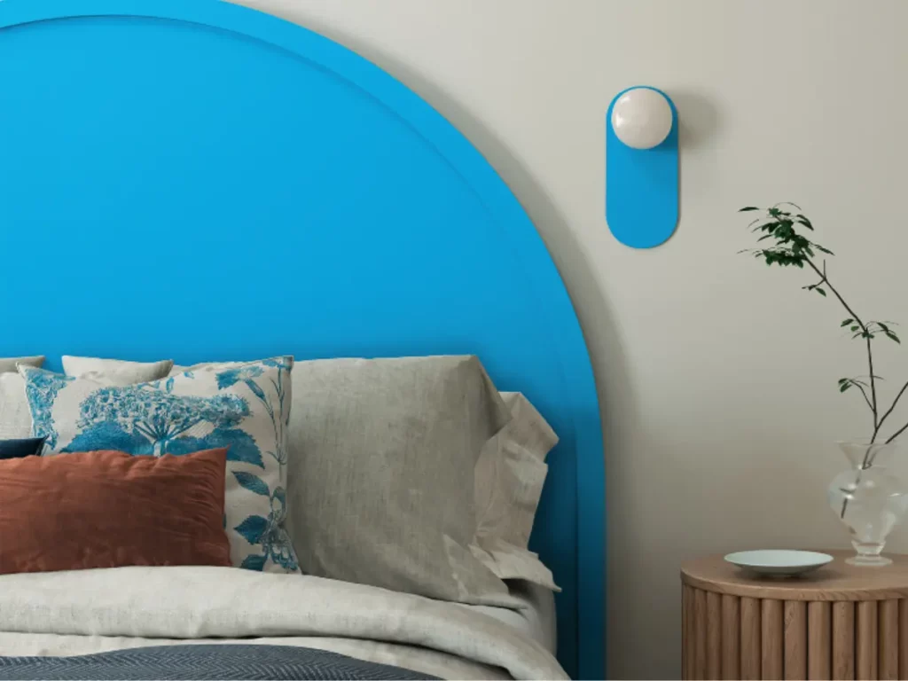
Benjamin Moore has set the stage for a vibrant year by announcing Blue Nova (825) as their coveted Colour of the Year for 2024.
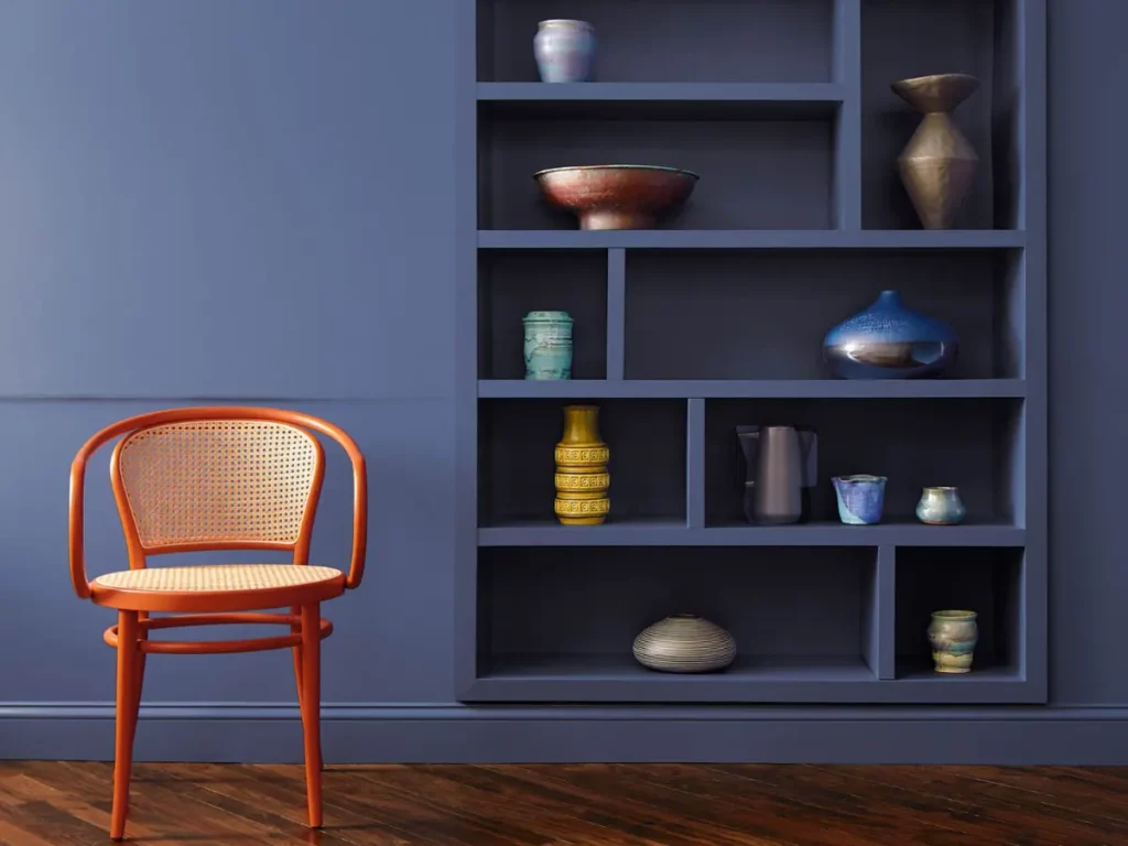
Blue Nova, a captivating blend of violet and blue, creates a soft, medium-tone hue that is nothing short of delightful.
Inspired by the vastness of outer space and the beauty of the cosmos, Blue Nova will be an exciting addition to your home’s interior. You don’t need deep pockets like NASA to bring the cosmic wonders into your abode.
If you plan to use Blue Nova in your home this year, here are some information that might be helpful:
Matching Colours:
- Paper White (1590)
- Mount Saint Anne (1565)
- Quincy Tan (HC-25)
- Monterey White (HC-27)
Different Shades:
- Misty Blue (820)
- Blue Ice (821)
- Riviera Azure (822)
- Steel Blue (823)
- Yin Yang (824)
- Stunning (826)
Similar Colours:
- Blue Heron (832)
- Athens Blue (797)
- Old Glory (811)
- French Violet (1427)
Thermal
C2’s colour of the year, like Benjamin Moore’s, is a shade of blue. It is a mid-tone blue that brings to mind the clear skies of autumn and the cosy scenes of winter.
C2’s Thermal evokes the feeling of a vast blue sky and the countless shades of blue found in nature.
C2’s 2024 Capsule Colours:
- C2 Brulee (546)
- C2 Marshland (918)
Skipping Stones
Well, it seems blue will dominate 2024 after all.
Dunn Edward’s Skipping Stones is a medium-toned steely blue with hints of green and grey. It is cool and refreshing but still gives that meditative and mysterious feel of the sea.
Viridis
This year, greens are also making an appearance. Graham & Brown’s Viridis is a soft, soothing, muted green. It’s the kind of green that looks great in any room and works well as an accent colour or main shade.
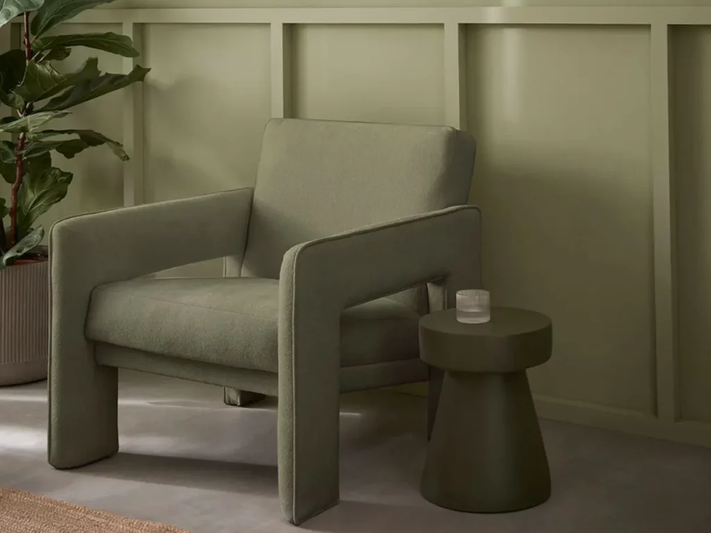
Viridis has the unique ability to create a tranquil atmosphere. Its sophisticated yet soothing mid-green tone evokes a sense of new beginnings.
Viridis represents growth and health, resembling the hues found in nature. Consequently, surrounded by this shade induces a restful and secure feeling, allowing you to unwind and feel at ease.
Bluebird
Krylon’s colour of the year selection is a delightful fusion of two popular colour trends – the soft elegance of pale pastels and the vibrant energy of bold, bright tones.
Bluebird is the perfect choice if you seek what is known as ‘dopamine decor’ or design elements that bring about a sense of happiness and well-being.
Upward
The colour selected as Sherwin-Williams’ 2024 colour of the year is a shade of blue that will emanate a sense of calm and serenity in your space.
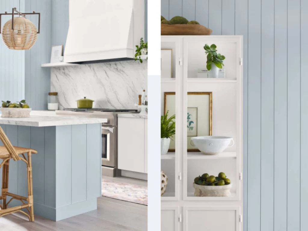
Upward is a soothing shade of blue that embodies a sense of bliss and freedom. It is the ethereal shade that envelops you when you deliberately ease your pace, inhale deeply, and grant your thoughts the space to disentangle.
Upward pairs well with the following colours:
- Drift of Mist (SW 9166)
- Gale Force (SW 7605)
- Tricorn Black (SW 6258)
- Honeydew (SW 6428)
- Palm Leaf (SW 7735)
- Antiquarian Brown (SW 0045)
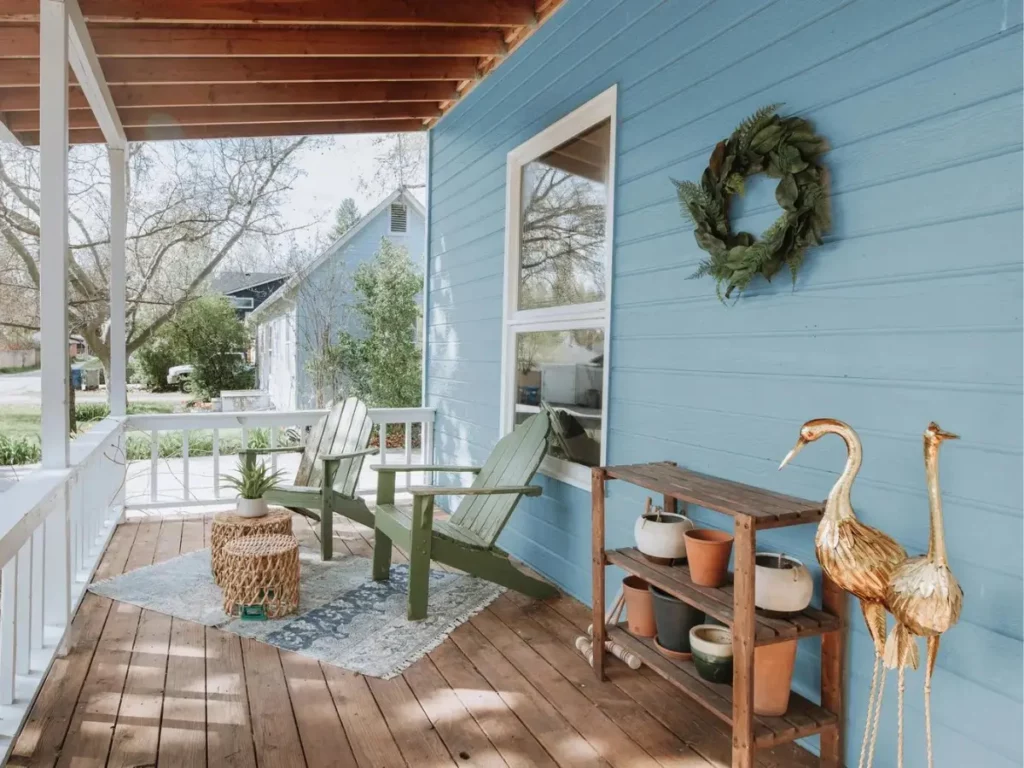
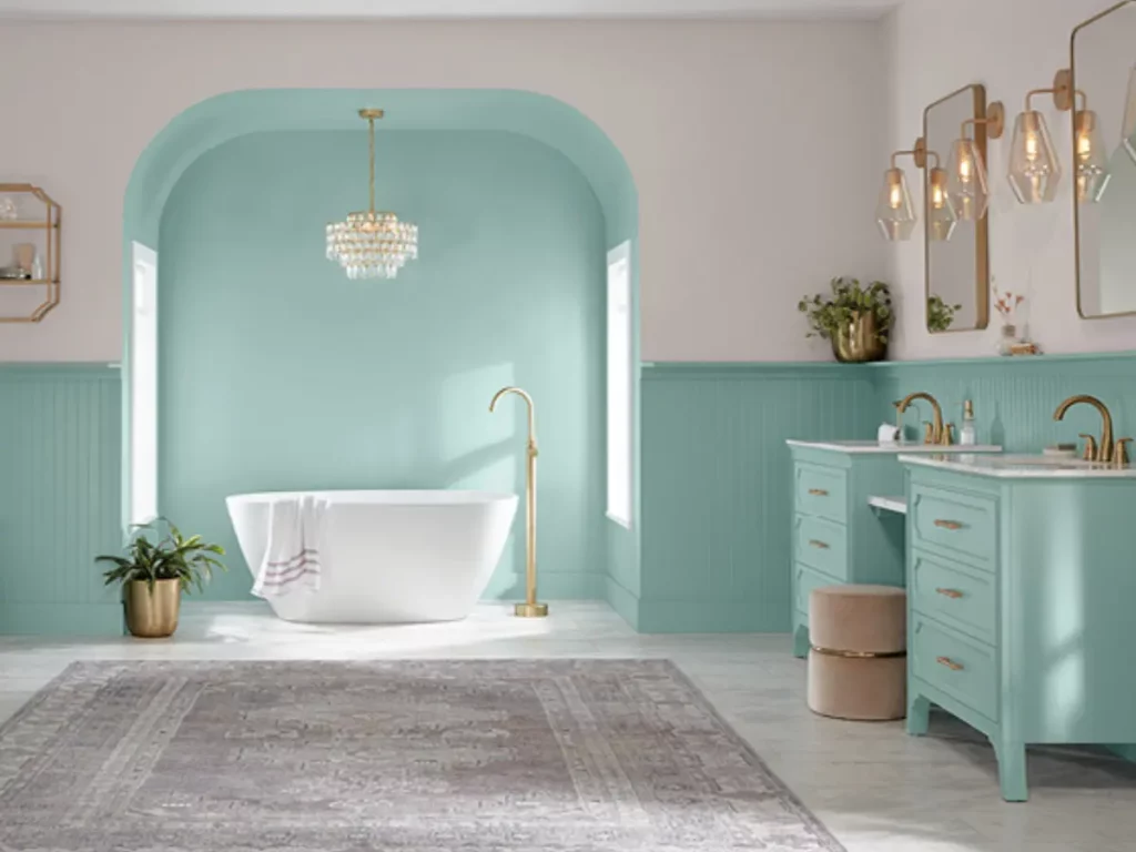
Bay Blue
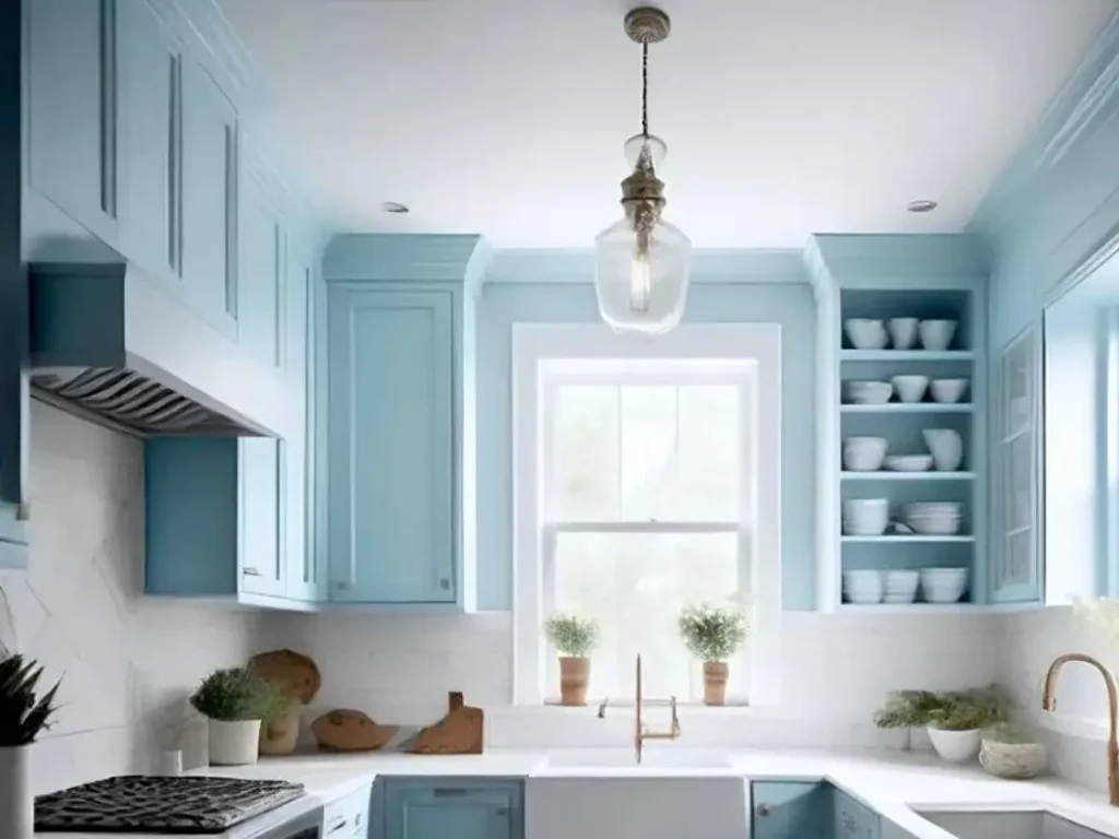
Minwax chose Bay Blue as their colour of the year for 2024. This mix of blue and green is calming, fresh, and grounding, making a bold statement yet remaining neutral enough to complement any room or style.
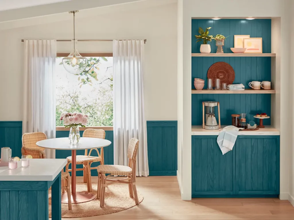
Bay Blue will enhance the natural wood present in your home. If you are a DIYer, this colour is the perfect shade for your next project.
It goes beyond the vibrant greens that have been popular lately, giving you a completely immersive colour experience.
Chocolate Cherry
Who doesn’t love chocolates?
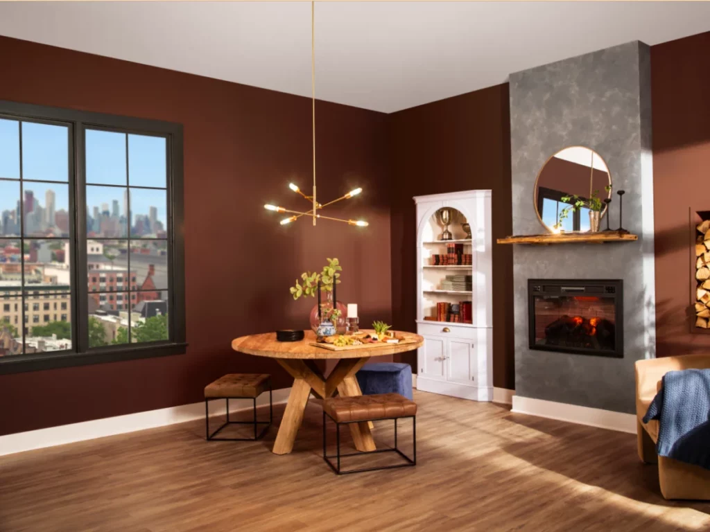
Indulge your senses with Rust-Oleum’s 2024 colour of the year, Chocolate Cherry.
This warm brown shade with red undertones instantly makes any room feel snug and tranquil. Trust me; you’ll want to curl up with a good book and a hot drink in a space surrounded by this beautiful colour.
You can imagine painting an entire room in this shade, and it won’t feel like you’ve gone overboard. And here’s the best part – it pairs perfectly with cooler colours to bring a sense of serenity and openness to your home.
Limitless
Glidden chose “Limitless” as its colour of the year for 2024. This colour is a honey-beige hue that is “anything but yellow”. Limitless has the strength of a primary colour and the adaptability of a neutral.
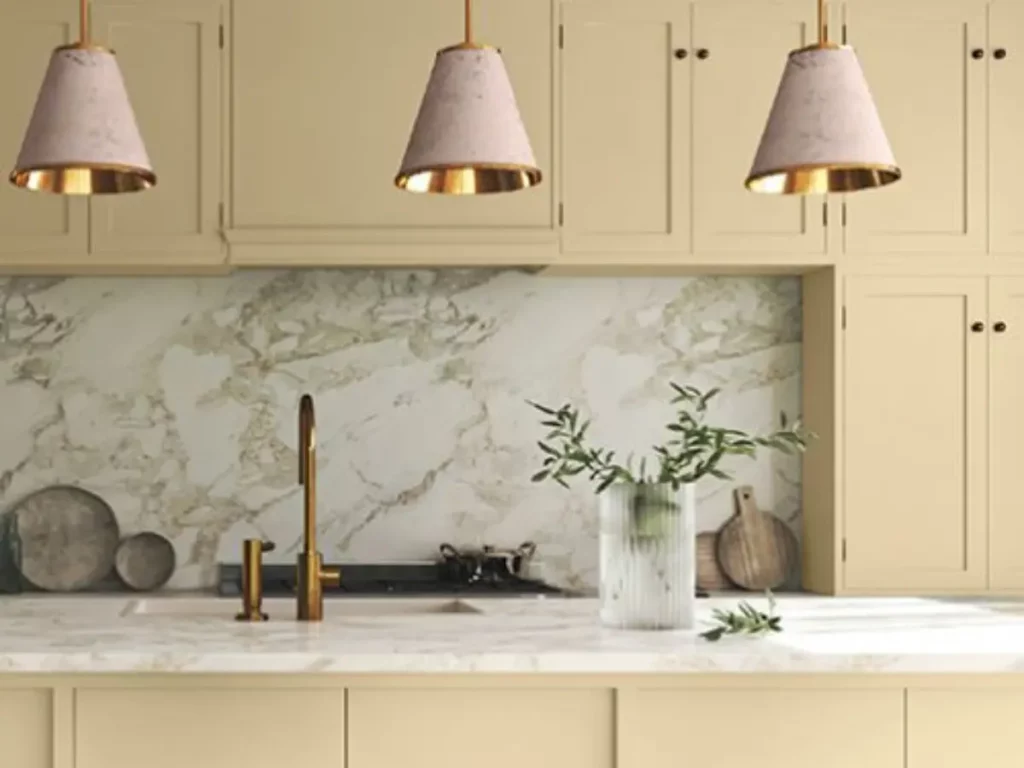
Nowadays, people are using colour in unique ways, so they need a colour palette that is versatile and can match both new and old decor.
You can use Limitless in all areas of your home, from kitchen cabinets to ceilings. No matter where you use this warm, neutral colour, it will always look great.
Glidden’s 2024 palette includes 16 colours, and here are some of them:
- Sweet Spiceberry (PPG1059-7)
- Persuasion (PPG1077-3)
- Subdued (PPG1015-4)
- Blush Beige (PPG1070-2)
- Craftsman Gold (PPG1092-4)
Renew Blue
Going back to blues, Valspar’s pick for colour of the year is Renew Blue. This particular shade has some lovely green influences, which helps you feel at peace wherever you use it.
I totally get where they’re coming from with this colour choice. I mean, who isn’t seeking a break from the craziness of everyday life? We all want a little less stress and a little less information overload, right?
Matching Colours:
- Perfect Backdrop (8005-8B)
- Dusk in the Valley (8004-3B)
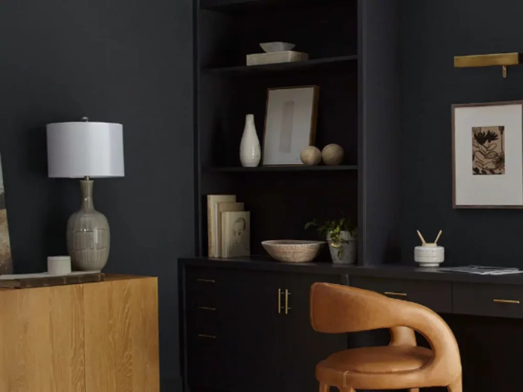
Cracked Pepper
You know what they say – black is always a classic. Cracked Pepper is Behr’s colour of the year that works like a charm for interiors and exteriors.
Nowadays, people are getting more adventurous with darker shades. The soft black Cracked Pepper hits the nail on the head as the perfect paint for the job.
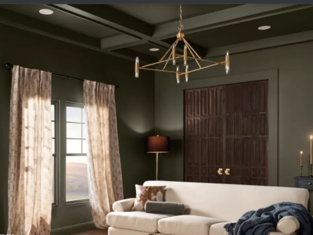
Ironside
Dutch Boy’s colour of the year, Ironside, is all about creating a space for wellness. Ironside is this deep, comforting green shade that brings so much calmness and reassurance.
It’s like having your little sanctuary at home that makes you feel good physically and mentally. Ironside is like a breath of fresh air.
Persimmon
Finally, we’re seeing more variety with HGTV Home by Sherwin-Williams’ colour of the year—Persimmon.
It’s a fantastic shade that combines earthy tones with a refreshing feel. It’s like an earthy terracotta with hints of tangerine.
You can use Persimmon to make your spaces feel more cosy and personalized.
Conclusion
So, there you have the latest colours for interior design for 2024. It seems blue will dominate the year on all fronts.
But we’ll see if that changes and another colour takes over. I know you can’t wait to start your next project using one of these colours.
As I said, these colours are the ones that have been announced, and there’s more to come. Don’t worry, though; we’ll keep you updated with the latest interior design colours.
So, which of these colours do you like the most? Let us know in the comments below!